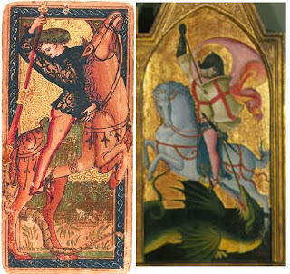
This St. Geroge, part of a small triptych, is one of the dal Ponte artworks that Bellosi compared favorably to the
Rothschild Knight of Batons. Ross, in reply, says:

When I compare the two, I see a similar overall design, with, as Ross noted, the backward thrusting of the Knight's spear. The horses have a similar narrow head, fat neck, and short forelegs on the horse. On the other hand, the Knight's horse's head is quite absurd, just a beak with eyes in back, on a massive neck. The artist would not be my choice to draw a favorite racehorse. Looking on the Internet at photos of rearing horses, it even seems like an impossible position for a horse. The realism of the horse's head and neck have been sacrificed for the sake of the rider. Whether it is a different draftsman from the St. George is hard for me to say; it might be that the artist wanted the rider to fit on the horse in a certain way and then make do with the rest..
As for the narrow format causing the artists to "economize space" in the same way, it seems to me that the artist of the card made the knight larger than St. George is in the triptych, to emphasize him, with the result that the horse is squeezed into an impossible space.
There was apparently also a watercolor. Fiorini quotes Vasari (my translation follows):
Estimates on the date of the triptych vary. The Columbia (South Carolina), Museum of Art, where it is preserved, estimates it as 1425. The Nov. 2016 catalog to the dal Ponte exhibition at the Galleria dell'Academia (p. 190) estimates it as 1415-1420. The same catalog estimates the one member of the cards on exhibit there (the Knight of Swords) as c. 1425, with a question mark next to dal Ponte's name.
The two figures share a striking similarity in that St. George is turned backwards. But in the manner of execution and compositional details, it seems evident even in the image as displayed on the internet that it is not the same draughtsman. Also, it surely can be argued that the narrow format of both the cards and the triptych caused their respective artists to economize space in this way.

When I compare the two, I see a similar overall design, with, as Ross noted, the backward thrusting of the Knight's spear. The horses have a similar narrow head, fat neck, and short forelegs on the horse. On the other hand, the Knight's horse's head is quite absurd, just a beak with eyes in back, on a massive neck. The artist would not be my choice to draw a favorite racehorse. Looking on the Internet at photos of rearing horses, it even seems like an impossible position for a horse. The realism of the horse's head and neck have been sacrificed for the sake of the rider. Whether it is a different draftsman from the St. George is hard for me to say; it might be that the artist wanted the rider to fit on the horse in a certain way and then make do with the rest..
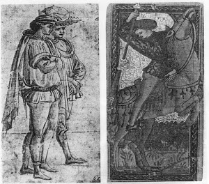
Bellosi did not only compare the card to the St. George, but also to "two young dandies", seen below (reproduced from Bellosi 1985). I see no difference between the draftsmanship of the young man closest to us and that of the Knight.
There are differences, to be sure: the intricate design on the Knight's doublet compared to the simpler one of the young man. But the face and the cut exposing the bottom half of the buttocks is the same, and perhaps these are what matters. 
As for the narrow format causing the artists to "economize space" in the same way, it seems to me that the artist of the card made the knight larger than St. George is in the triptych, to emphasize him, with the result that the horse is squeezed into an impossible space.
There was apparently also a watercolor. Fiorini quotes Vasari (my translation follows):
The standard translation of Vasari has "Dragon" as the translation of "serpente" here; but the Italian word did not mean "dragon" that I can determine. It seems to me that on the card, likewise, what is depicted is a serpent rather than a dragon. If he was not trying to depict precisely St. George--hence the courtly attire--but rather a knight similar to St. George but killing a snake, then the watercolor could well have been a study for the card. (I don't understand the bit about the skeleton, the "ossatura di morte".) I suppose the watercolor could have been a study for the triptych (which also has no skeleton), but the less narrow space there, I think, would have more likely led to something more conventional. It is the quite narrow space of the card that would seem to dictate the unique design.«Nel nostro libro de' disegni di diversi, antichi e moderni, è un disegno d'acquerello di mano di Giovanni, dov'è un San Giorgio a cavallo che occide il serpente et un'ossatura di morto che fanno fede del modo e maniera, che aveva costui nel disegnare» 31.
________________________
31. G Vasari, Le vite de' più eccellenti pittori, scultori et architettori 1550-1567, II, Roma, 1991, pp. 223-224.
("In our book of drawings by diverse ancients and moderns there is a drawing in watercolor by the hand of Giovanni, wherein is a St. George on horseback who is slaying the serpent, and a skeleton, which bear witness to the method and manner that he had in drawing.")
__________________
31. G. Vasari, The lives of the most excellent painters, sculptors and architects 1550-1567, II, Rome, 1991, pp. 223-224.
Estimates on the date of the triptych vary. The Columbia (South Carolina), Museum of Art, where it is preserved, estimates it as 1425. The Nov. 2016 catalog to the dal Ponte exhibition at the Galleria dell'Academia (p. 190) estimates it as 1415-1420. The same catalog estimates the one member of the cards on exhibit there (the Knight of Swords) as c. 1425, with a question mark next to dal Ponte's name.
No comments:
Post a Comment