Before going on to the fifth issue that I
stated at the beginning of the thread, I want to address an issue that I
was not aware of initially, namely, that of the influence of Spanish-suited
cards on the Rothschild. This issue was discussed on the ATF thread but I
want to add some things. The most thorough starting point is on Andy's
Playing Cards, the "Ferrara" page (http://l-pollett.tripod.com/cards89.htm).
First, the Rothschild has a bearded Page of Coins, a rather unusual feature in Italian pages, which are typically presented as young and beardless:

Andy comments:

Beards are also on the Knight and King of Swords.
There is also, in the Rothschild, the double-shell tortoise shield of the Knight of Swords. It has more significance than just protection. Andy says:

Ross, at http://www.tarotforum.net/showpost.php? ... stcount=69, says, based on this resemblance, that the Knight of Swords is a defeated Saracen. Andy's page on the Italy 2 tends to support that:

First, the Rothschild has a bearded Page of Coins, a rather unusual feature in Italian pages, which are typically presented as young and beardless:

Andy comments:
On Andy's "Italy 2" page (http://l-pollett.tripod.com/cards77.htm), it is the Page of Batons that wears the beard....this is not a unique feature: in fact, a similar one is found in the so-called Italy 2 cards (after their catalogue number in the Fournier Museum of Alava, Spain), an archaic Latin-suited pattern of Moorish inspiration, surely earlier than the RS by several decades, which testifies the existence of bearded knaves at an early stage of Western playing card history.
Beards are also on the Knight and King of Swords.
There is also, in the Rothschild, the double-shell tortoise shield of the Knight of Swords. It has more significance than just protection. Andy says:
Here it is:This particular shape, and the position it is held in, are both very similar to the shield carried by the Moorish cavalier of Swords in the aforesaid Italy 2 deck.
Ross, at http://www.tarotforum.net/showpost.php? ... stcount=69, says, based on this resemblance, that the Knight of Swords is a defeated Saracen. Andy's page on the Italy 2 tends to support that:
The cavalier of Swords is also a Moor; note the pointed cap and the shield, both in the fashion of the Saracens, although the blade of the sword is not curved.
"Andy's playing cards" (http://l-pollett.tripod.com/cards77.htm)
suggests, based apparently on the apparel, that cards of such design were fairly common
throughout a wide area. In fact in the Fournier museum in Spain they
are called "Italy 2", about which Andy says:
Such cards undoubtedly would have passed through Florence. Andy gives c. 1400 as the date by which these cards were diffused beyond Spain. Ross explains further that an article by Michael Dummett in 1991 shows that the paper is dated to around 1400. He adds ((http://www.tarotforum.net/showpost.php?p=1330082&postcount=69)::Despite the museum's catalogue reference of this deck is Italy 2, it may come from anywhere within a wide area, now corresponding to Spain, northern Italy, southern France, Switzerland, and south-western Germany. It was found in Seville, and the only country where the same composition is used is Spain, but some scholars claim that the cap featured on the ace of Coins is consistent with a north-eastern Italian origin, while others identify the clothes worn by the courts as German.
...
The cavalier of Swords is also a Moor; note the pointed cap and the shield, both in the fashion of the Saracens, although the blade of the sword is not curved. A cavalier of Swords from the mid 1500s, wearing more generically a Moorish turban, is also found in the German Playing-card Museum of Leinfelden, and even among the patterns still in use traces of this personage can be found, giving enough evidence that this used to be a rather common subject.
Thierry Depaulis also independently confirms the scientific information of the paper's dating in his article "L'Apparition de la xylographie et l'arrivée des cartes à jouer en Europe" (Nouvelles de l'Estampe nos. 185-6, Dec. 2002-Fev. 2003, pp. 7-19) p. 18; here he cites Dr. José Eguia, director of the Fournier Museum of Playing Cards in Vitoria, Spain, where this set is located).
In Florence, one artist who would have known the meaning of the odd shields, that they were Saracen/Moorish, was Starnina, who returned to Florence from a stay in Valencia in 1401. At some point (he is said to have died in 1413) he even did a cassone, as Fiorini points out.
Facilmente documentabile in dipinti di matrice spagnola, non lo è altrettanto nell'arte italiana: l'unico esempio che sono riuscita a reperire è rappresentato dalla Battaglia tra Orientali conservata nel Museo di Altenburg ed eseguita da Gherardo Stamina. Notizia di scarso interesse se npn fosse che l'artista in questione, attivo a Firenze dopo un lungo soggiorno a Valencia, fu il principale maestro di Giovanni di Marco, il quale potrebbe essersi ispirato allo Stamina per l'inserimento di questo colto riferimento.
(Easily documented in paintings of the Spanish matrix, it is not so in Italian art: the only example I could find is represented by the Battle among Orientals preserved in the Museum of Altenburg done by Gherardo Starnina. The artist in question made news of little interest; active in Florence after a long stay in Valencia, he was the main master of Giovanni di Marco, who may have been inspired by Starnina for the inclusion of this cultural reference.)
Ross posts an image of this "Battaglia tra
Orientali" (Battle between Orientals) in the same ATF post, of which a partial view below shows the detail of the shield. :

Ross objects to Fiorini's attempt to connect the presence of the shields in the Rothschild with dal Ponte via Starnina:
It could well be that the Rothschild artist intended to portray this figure as a defeated Saracen (giving us an opportunity to interpret the St. George-like portrayal of the Knight of Batons as slaying the Saracen dragon), and it could well be that the artist was drawing from a tradition known through Aragonese cards and/or artistic convention; but given that such a tradition did in fact exist among cardmakers, and the differences in the style of the two printed cards and the painted one, it seems to me unnecessary to posit a direct link of the Rothschild to the work of Gherardo Starnina, through Giovanni del Ponte.
That is certainly true. The cards were known independently of Starnina and so do not need a painter intimately connected with him. However it remains true that dal Ponte was greatly influenced by Starnina and probably knew him personally. The connection is reiterated by Lorenzo Sbaraglio in "Lo sviluppo (altalenante) dello stile di Giovanni dal Ponte", in the Nov. 2016 catalog (pp. 13-14).
QUESTION FIVE: Can the style of the cards be dated specifically to the 1420s as opposed to the 1450s-1460s?
Ross wrote

The Rothschild on our left is Late Gothic, the Charles VI on the right firmly Renaissance. On the left, the figure of the Emperor is generally flat, except for the folds in the tunic, for which da Ponte and other Late Gothic artists knew how to create depth by means of shading. The arm reaching for the scepter is especially awkward, as well as its connection to the hand grasping it. In contrast, the one on the right has volume, due to knowledge of perspective, and the arm is more natural, with the hand clearly part of the arm. On the left we see the usual fine details we expect in Late Gothic fabric depiction. On the right, there is less attention to the fabric (except on one of the pages!). Fancy clothing was out of fashion by its time. What remains is homage to past Emperor cards and to emperor's exalted status. The two little figures below the right-hand Emperor are done without any sense of being physically part of the scene. That is a medieval strategy. On the right, the two figures have been changed to boys, so that physically the whole scene is believable. (I am not sure how they manage to kneel on air, but I am not saying the artist was perfect.) Also the way the two boys line up shows a knowledge of single-point perspective with a vanishing point inside the frame. That is lacking on the left. Also, the head of the boy in back is slightly smaller than that of the one in front, also creating an illusion of depth. The platform also has depth, lacking on the left. And the Emperor himself is placed diagonally to the plane of the frame, rather than parallel or perpendicular to it, creating depth. The net result is a Renaissance image on the right, a late-medieval image on the left. The change was sudden, starting with Masaccio and Brunelleschi in Florence, and probably a similar trend in Bruges, although it isn't documented there until around 1433 with van Eyck. Some people (e.g. Hockney) speculate that it had to do with the development of large lenses for focusing images that could be traced (which is not to say that these marvelous paintings are just tracings; it is more that they show a new way of seeing.)
Yes, some people might have preferred the old style. But there is no indication that such was true of the most influential families in Florence. The new style was seen as magical, almost miraculous, like having the person in front of one, writers said. An artist who had mastered it would not want it to appear that he hadn't. Although there is an inherent conservatism in card designs, the Charles VI Emperor shows what could be done with an old pattern. Even while in the new style, it was late enough so that it is not at all ground-breaking. Some artists did have trouble with the new style. That may be why the Catania looks more medieval than the Charles VI (flat, less realistic)--or, although done in Florence, was for a family outside of Florence (i.e. Alessandro Sforza) who would hae wanted its cards more Gothic, as in Milan. Or perhaps in fact it was done earlier than usually supposed, even in the 1430s. A recent Playing Card article reports that pieces of paper used as filler in two of the Catania deck's cards (one of which is in Palermo) have the dates 1427 and 1428 written on them. But even the Catania, unlike the Rothschild, shows knowledge of the principle of one-point perspective (the Chariot). Nothing is definite, to be sure, as we don't know the particular circumstances for any of these decks. We can only judge by what is known in relation to other things known..
In this spirit, it is worth looking at the dates that have been assigned to the work of dal Ponte's that is most comparable to the cards. The triptych with St. George is assigned by the Columbia (South Carolina) Museum of Art to c. 1425. The Nov. 2016 catalog gives it to 1415-1420. Neither place gives any reason for their dating. I don't think it matters, because the other comparable art is mostly after 1425. The Santa Trinita fresco with the squiggly bears on St. Benedict is 1429-1432. Other work at St. Trinita, less "cursive", is 1434; both are documented as to date and workshop.. The "two dandies" (here) is in the 2016 Catalog's estimate, "1425-1430". The predella with St. Anthony Abbot, so similar to the Emperor in the face (here), is "1425-1530". In allegorical art, the only paintings of the workshop similar in subjects to the tarocchi are the 7 virtues and 7 liberal arts, which the Catalog dates to "1430-1435". So it is possible by stylistic and subject considerations to make the date of the cards, if by the dal Ponte workshop, extend to 1430-1435..
There is also the question of whether it is a regular deck, an imperatori, or a tarocchi. The late 1420s or early 1430s is not too early for any of these. The Catania paper has the dates 1427 and 1428 in the filler for two of the cards. DDD in 1996 said the tarocchi could be as early as 1410. Prince Fibbia, who the subscript on a 17th century portrait said invented the tarocchini (as the Bolognese tarocchi was then called), died in 1419 (see Andrea Vitali at http://www.associazioneletarot.it/page.aspx?id=107&lng=ENG) . The Marziano "game of the gods" is 1418-1425, and Marziano was succeeded in his position by the father of a man who published a lengthy commentary on Petrarch's Trionfi (see http://forum.tarothistory.com/viewtopic.php?f=11&t=1130&p=18314&hilit=commentary+trionfi+Petrarch#p18314). There are considerations that suggest the 1428 marriage for the CY-type, if there was one: the banner on the tent, which could be Savoy, as the alternation of banners suggests among other things the union of two houses; also, Filippo finishing an illuminated manuscript of his father's, by a young painter who could easily have been prevailed upon to do cards. Surely 1430-1435 is not too early in Florence, for an elite stratum of the population, and perhaps not including all 22 of the cards but only 14 or 16.
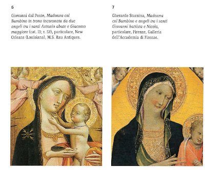
I didn't make jpgs of figs. 3-5 (two Madonna and Childs plus some musician angels. Maybe tomorrow. Figs. 6-7 give some of the idea. These are pre-1415, before he developed his own unique style (which is what is reflected in the cards)La situazione per Giovanni, e per tanti altri artisti fiorentini e toscani, cambiò di li a breve col ritorno di Gherardo Starnina dalla Spagna, probabilmente non molto dopo il luglio 1401, quando è ricordato per l’ultima volta a Valencia. Nelle sue primissime opere Giovanni dal Ponte sembra innestare su una solida base trecentesca lo stile di Starnina (fig. 3): le lumeggiature ottenute sinteticamente con pochi tocchi di pennello, i colori accesi, una certa insistenza grafica sui tratti principali del viso, che delimitano incarnati modulati dolcemente. Giovanni riprende anche dei veri e propri “tic” tipici dello Starnina, quali la maniera di lumeggiare la canna del naso con una dritta linea bianca che si addensa sulla punta, o i dentiche talvolta emergono tra le labbra schiuse per rafforzare, l’espressione dei volti (fig. 5); elementi che Giovanni [start 14] riprende in maniera tanto fedele da lasciar sospettare che il contatto col pittore tornato dalla Spagna potesse essere stato assai stretto. Dell'arte di Starnina, più in generale, il pittore dovette apprezzare lo spirito vitale, colorato, accostante, giocoso e profano, caratteristiche che in Giovanni si trasformano progressivamente in uno stile più drammatico e concitato, energico e corsivo.
[The situation for Giovanni, and for many other Florentine and Tuscan artists, changed shortly after the return of Gherardo Starnina from Spain, probably not long after July 1401, when he is recorded for the last time in Valencia. In his first few works Giovanni dal Ponte seems to graft the style of Starnina onto a solid trecento basis (fig. 3): the highlights synthetically obtained with a few brush strokes, bright colors, some graphic insistence on key facial features that delimit embodied softly modulated. Giovanni also incorporates a real "tick" typical of Starnina in such manner highlighting the nose rod with a straight white line that thickens at the tip, or the teeth that sometimes emerge between lips parted for strengthening the expression of the faces (fig. 5); elements that John [start 14] resumes in a manner so faithful as to allow one to suspect that the contact with the painter returned from Spain could have been very tight. From the art of Starnina, more generally, the painter had to appreciate his vital spirit, colorful, pulled together, playful and profane, characteristics that in Giovanni are turned into a more dramatic and agitated style energetic and cursive.]
QUESTION FIVE: Can the style of the cards be dated specifically to the 1420s as opposed to the 1450s-1460s?
Ross wrote
I certainly don't want to push the Charles VI back in time! Probably the best comparison will be with the Emperor cards, since the subjects are the same (higher res at http://2.bp.blogspot.com/-CNly6whjDyE/U ... hVIEmp.jpg).Compare the Charles VI lines with the Rothschild cards' (particularly hands and faces). I think appeals to generic style is a blunt way to date objects; it might only work within less than a couple of decades at best, unless you already have the artist pegged. Do you want to push Charles VI back to the 1420s or 30s just because it isn't an example of the latest style in Florentine taste in art?
More likely, cards are quick and cartoon like; they don't really reflect the dominant, let alone the avant garde, style in art. Bembo's are exceptional, in being specific commissions in a traditional style for a specific patron; Charles VI and Rothschild may be high-end retail objects, dedicated to no particular person. And even if they were, how do we know that they wanted the "new" style? Playing cards generally don't break ground in art.
The Rothschild on our left is Late Gothic, the Charles VI on the right firmly Renaissance. On the left, the figure of the Emperor is generally flat, except for the folds in the tunic, for which da Ponte and other Late Gothic artists knew how to create depth by means of shading. The arm reaching for the scepter is especially awkward, as well as its connection to the hand grasping it. In contrast, the one on the right has volume, due to knowledge of perspective, and the arm is more natural, with the hand clearly part of the arm. On the left we see the usual fine details we expect in Late Gothic fabric depiction. On the right, there is less attention to the fabric (except on one of the pages!). Fancy clothing was out of fashion by its time. What remains is homage to past Emperor cards and to emperor's exalted status. The two little figures below the right-hand Emperor are done without any sense of being physically part of the scene. That is a medieval strategy. On the right, the two figures have been changed to boys, so that physically the whole scene is believable. (I am not sure how they manage to kneel on air, but I am not saying the artist was perfect.) Also the way the two boys line up shows a knowledge of single-point perspective with a vanishing point inside the frame. That is lacking on the left. Also, the head of the boy in back is slightly smaller than that of the one in front, also creating an illusion of depth. The platform also has depth, lacking on the left. And the Emperor himself is placed diagonally to the plane of the frame, rather than parallel or perpendicular to it, creating depth. The net result is a Renaissance image on the right, a late-medieval image on the left. The change was sudden, starting with Masaccio and Brunelleschi in Florence, and probably a similar trend in Bruges, although it isn't documented there until around 1433 with van Eyck. Some people (e.g. Hockney) speculate that it had to do with the development of large lenses for focusing images that could be traced (which is not to say that these marvelous paintings are just tracings; it is more that they show a new way of seeing.)
Yes, some people might have preferred the old style. But there is no indication that such was true of the most influential families in Florence. The new style was seen as magical, almost miraculous, like having the person in front of one, writers said. An artist who had mastered it would not want it to appear that he hadn't. Although there is an inherent conservatism in card designs, the Charles VI Emperor shows what could be done with an old pattern. Even while in the new style, it was late enough so that it is not at all ground-breaking. Some artists did have trouble with the new style. That may be why the Catania looks more medieval than the Charles VI (flat, less realistic)--or, although done in Florence, was for a family outside of Florence (i.e. Alessandro Sforza) who would hae wanted its cards more Gothic, as in Milan. Or perhaps in fact it was done earlier than usually supposed, even in the 1430s. A recent Playing Card article reports that pieces of paper used as filler in two of the Catania deck's cards (one of which is in Palermo) have the dates 1427 and 1428 written on them. But even the Catania, unlike the Rothschild, shows knowledge of the principle of one-point perspective (the Chariot). Nothing is definite, to be sure, as we don't know the particular circumstances for any of these decks. We can only judge by what is known in relation to other things known..
In this spirit, it is worth looking at the dates that have been assigned to the work of dal Ponte's that is most comparable to the cards. The triptych with St. George is assigned by the Columbia (South Carolina) Museum of Art to c. 1425. The Nov. 2016 catalog gives it to 1415-1420. Neither place gives any reason for their dating. I don't think it matters, because the other comparable art is mostly after 1425. The Santa Trinita fresco with the squiggly bears on St. Benedict is 1429-1432. Other work at St. Trinita, less "cursive", is 1434; both are documented as to date and workshop.. The "two dandies" (here) is in the 2016 Catalog's estimate, "1425-1430". The predella with St. Anthony Abbot, so similar to the Emperor in the face (here), is "1425-1530". In allegorical art, the only paintings of the workshop similar in subjects to the tarocchi are the 7 virtues and 7 liberal arts, which the Catalog dates to "1430-1435". So it is possible by stylistic and subject considerations to make the date of the cards, if by the dal Ponte workshop, extend to 1430-1435..
There is also the question of whether it is a regular deck, an imperatori, or a tarocchi. The late 1420s or early 1430s is not too early for any of these. The Catania paper has the dates 1427 and 1428 in the filler for two of the cards. DDD in 1996 said the tarocchi could be as early as 1410. Prince Fibbia, who the subscript on a 17th century portrait said invented the tarocchini (as the Bolognese tarocchi was then called), died in 1419 (see Andrea Vitali at http://www.associazioneletarot.it/page.aspx?id=107&lng=ENG) . The Marziano "game of the gods" is 1418-1425, and Marziano was succeeded in his position by the father of a man who published a lengthy commentary on Petrarch's Trionfi (see http://forum.tarothistory.com/viewtopic.php?f=11&t=1130&p=18314&hilit=commentary+trionfi+Petrarch#p18314). There are considerations that suggest the 1428 marriage for the CY-type, if there was one: the banner on the tent, which could be Savoy, as the alternation of banners suggests among other things the union of two houses; also, Filippo finishing an illuminated manuscript of his father's, by a young painter who could easily have been prevailed upon to do cards. Surely 1430-1435 is not too early in Florence, for an elite stratum of the population, and perhaps not including all 22 of the cards but only 14 or 16.
No comments:
Post a Comment