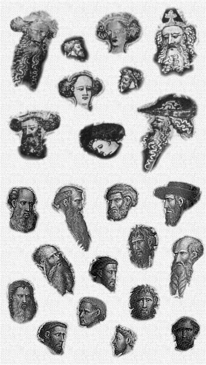
There are no women's heads in the selection from Giovanni: they are all bearded men. When I look up dal Ponte's works on the Internet, it seems to me that women's heads are more elongated, just as in the cards, e.g. at http://commons.wikimedia.org/wiki/File: ... roject.jpg, a work estimated to be from 1410-1419. St. Catherine's is, too, along with the female angels, at http://upload.wikimedia.org/wikipedia/c ... herine.jpg. But the older woman in the middle has a rounder face. That's the Late Gothic style: young women are portrayed with lean, oval faces, and high foreheads; men and older women are portrayed rounder. You will see the same in Michelino and other Late Gothic artists. Younger, clean shaven men will be portrayed somewhere in the middle.I shared these thoughts first with Michael Hurst, and he looked too; then he looked more precisely at some of what was available of Giovanni on the web, and the Rothschild cards, and came up with this collage of facial comparisons:
The top nine images are from the Rothschild cards; the bottom fourteen are from three works of Giovanni -
1---2---3---4
----------7--
5---6-------8
9----10---11
--12---13---14
Reading them as the numbers above, they are -
1 and 9: Two evangelists, Rijksmuseum, Amsterdam, SK-A-3979 and 3980 (35x14cm), dated 1410-1435
2,3,4,5,6,7 and 8: Ascension of St. John the Evangelist, National Gallery, London, NG580 (triptych, 207x250 cm), dated 1410-1420.
10, 11, 12, 13, 14: Coronation of the Virgin, Galleria dell'Accademia, Firenze (couldn't find the catalogue number or size), no date found.
Giovanni's facial proportions and style remains consistent from large to small works, and across time.
Comparing with the card's faces and heads, it doesn't seem to be the same style. Particularly noteworthy are the presence of well-formed ears in Giovanni's paintings, whereas in the cards there are few and they are little more than circles.
Also, the faces are squat, and the noses are not long in the cards, whereas all of Giovanni's faces have very long noses.
The particular way of indicating curls in beards and hair isn't so similar between the two in this side-by-side comparison.
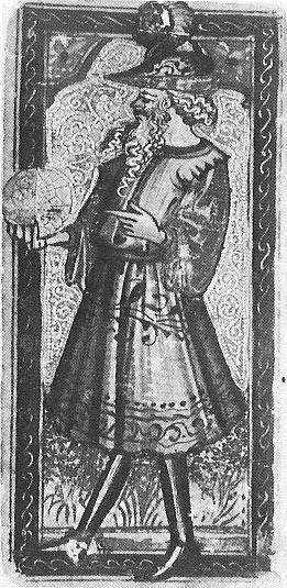
Ross contrasts the consistency of Bembo's heads in his pack (I assume the PMB) and all the rest of his work with the inconsistency of the Rothschild. To me that is a sign that the Rothschild is considerably earlier than the PMB. If you look at the Cary-Yale, you will see all sorts of heads.

The young man in armor here gets an oval, too, suggesting that he is thinner. It is an example of Late Gothic, which lasted longer in Milan than it did in Florence. All the same, by the time of the PMB, painting had become a science in the tradition of Alberti's "On Painting", as well as an art: hence the greater consistency of the PMB.
About the long noses, I don't see many "very long" ones in dal Ponte, although admittedly most are not short. In the Truimph of Fame, the noses aren't long at all:
However, this cassone is not securely by dal Ponte. Other art that is more securely his, however, does show both long and short noses, e.g.St Peter below, with what I assume is an angel (detail reproduced from 2016 Catalog p. 24). There are other examples, usually angels or soldiers. Another example would be the "two dandies" mentioned by Bellosi and posted here in connection with the Knight of Batons.

It is true that long noses predominate in dal Ponte's art, especially in biblical scenes. One reason may be to suggest a positive view of Jews as the people of Christianity's origin. In the 1420s and after, the ruling families wanted the presence of Jewish moneylenders to be accepted in Florence. They performed functions the Christian bankers did not care to do and would be a source of revenue. Jews in fact first entered in 1427, according to Tuscan Jewish Itineraries, with three pawn shops, "a move which marked the beginning of the Jewish community in that city" (p. 143). Such a setting would not apply to the cards (or to figures in the art not imagined in a Jewish milieu, such as angels).
Finally, there is the manner of drawing ears and beards. One is the Queen of Batons, http://www.photo.rmn.fr/LowRes2/TR1/PG0 ... 000752.jpg. But it may be that this is only the bottom of her ear, the rest covered by hair. Dal Ponte does that some of the time in his paintings. In the King of Coins, it looks like part of the ear is covered by his hat, http://www.photo.rmn.fr/LowRes2/TR1/8JM ... 000755.jpg. But the Jack of Coins' ear is indeed rather weak, merely a circle (http://trionfi.com/0/c/p/rothpope.jpg)/. If you notice, the Cary-Yale court cards don't have prominent ears either. Ears perhaps were considered inelegant in a courtly, secular setting. There can be other reasons for the little circles that do for ears in two of the cards: dal Potne was not used to the small size of the cards and found it difficult to make the ears look realistic; or he was in a rush and wasn't getting paid much; or he gave that detail to an assistant.
As far as the beards, some of the Rothschild cards have white squiggles down them, unlike the paintings. Late Gothic art has a playful side, like the outlandish hats that are sometimes shown, especially on men, in say Pisanello (http://jeannepompadour.tumblr.com/post/ ... -falcon-by). The cards are for entertainment. You're supposed to enjoy the tortoise shell shields and the lacy outfits and tight tights on the young men. The squiggles on the beards fall in that category, and they complement the strong lines of the clothing. It is part of his "cursive" style that art historians have noted. There are also squiggly beards on known paintings of dal Ponte's workshop, most notably the frescoes in a family chapel shown and documented in the 2016 Catalog p. 23): The work in this chapel is documented in a notarial contract for 1429, extended by one month in June of 1432 (Nov. 2016 Catalog, pp. 200, 229, and 231-2; for detailed quotations see http://forum.tarothistory.com/viewtopic.php?f=11&t=1005&start=80).
And in general, hair is highlighted by broad strokes, as in the detail of St. Peter above.
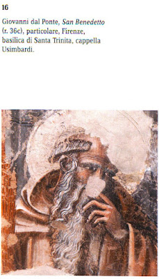
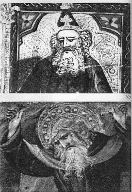
In a few cases the similarity of the faces.is quite striking, as in a comparison between the Emperor and dal Ponte's St. Benedict brings out (below, taken from Bellosi):
On Fieroni's side there is also the fallback position: dal Ponte may have had an assistant doing much of the work, working from da Ponte's sketches and creating the details himself. If both cassoni and the deck were for the same occasion (a wedding), he may have been too busy painting cassoni.
In other words, the differences in the faces (whoever the artist) tend only to show that the cards are solidly Late Gothic, the style in Florence up to the mid to late 1420s, which gradually transitioned to Renaissance style by 1440. Dal Ponte did incorporate some aspecs of this new style in the late 1420s, according to the 2016 catalog essay by Sbaraglio, but in general his work remains solidly Late Gothic. In general the similarities to the cards outweigh the differences. ..
There is, to be sure, a conservatism in card-making, a tendency to stick closely to what came before. But when is that "before"? I propose that it's when the style was in fashion. I'll say more later, when I have the two Emperors side by side.
.
No comments:
Post a Comment